Games For Change — Driving Social Impact Through Games
My Role:
- UX Researcher & Strategist
- UX/UI Designer
- Content & Information Architect
Deliverables:
- Website audit
- Audience & content analysis
- Reorganized sitemap
- Wireframes
- High-fidelity UI mockups
This work was created for my Creative Fellowship project in 2017, at a time when I didn’t yet know anything about UX or UI design. With no formal guidance, I instinctively approached the redesign through a user-centered lens, conducting research, breaking down user needs, and restructuring the information architecture.
This project was a hint at the kind of work I naturally gravitate towards, and a major reason I’m returning to UX and interactive design today.
The Problem
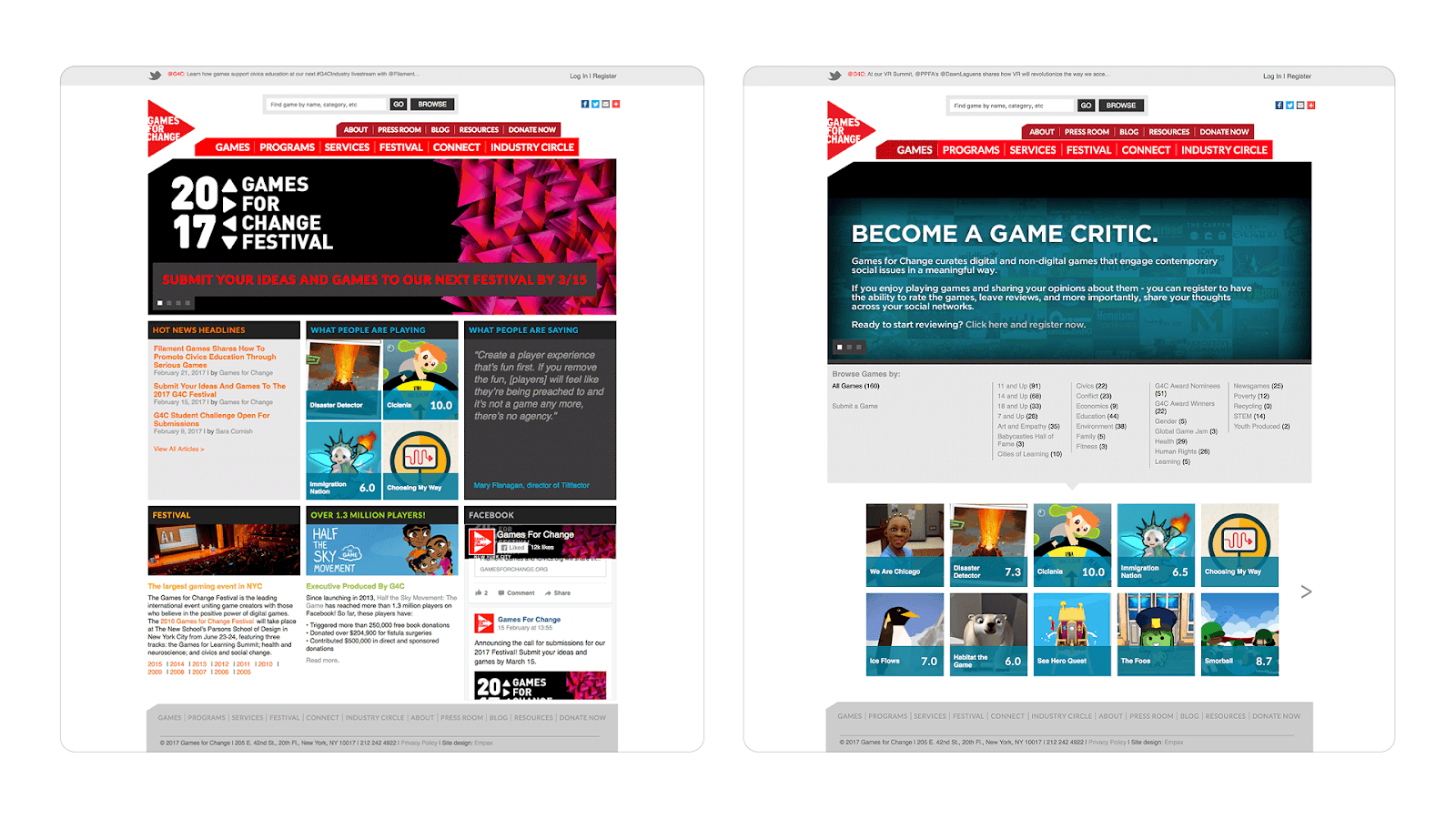
Games for Change (G4C) is an organization that facilitates the creation and distribution of social impact video games. Unfortunately, their website at the time didn’t clearly communicate this mission or what G4C really offered.
I identified a few key issues:
- Confusing navigation: Overloaded, unorganized menus with too many options and no clear user pathways
- Unclear mission and values: It wasn’t obvious who the site was for or why someone should care
- Outdated visual design: The site didn’t reflect the modern, innovative space G4C operates in, especially considering their audience is likely web-savvy
Research & Insights
Priorities
In order to reorganize the site and give a better overall impression of what G4C is, I needed to better understand the organization’s priorities.
Since this wasn’t a real client, I decided to look at their public social media channels as a way to infer what G4C considers “important”.
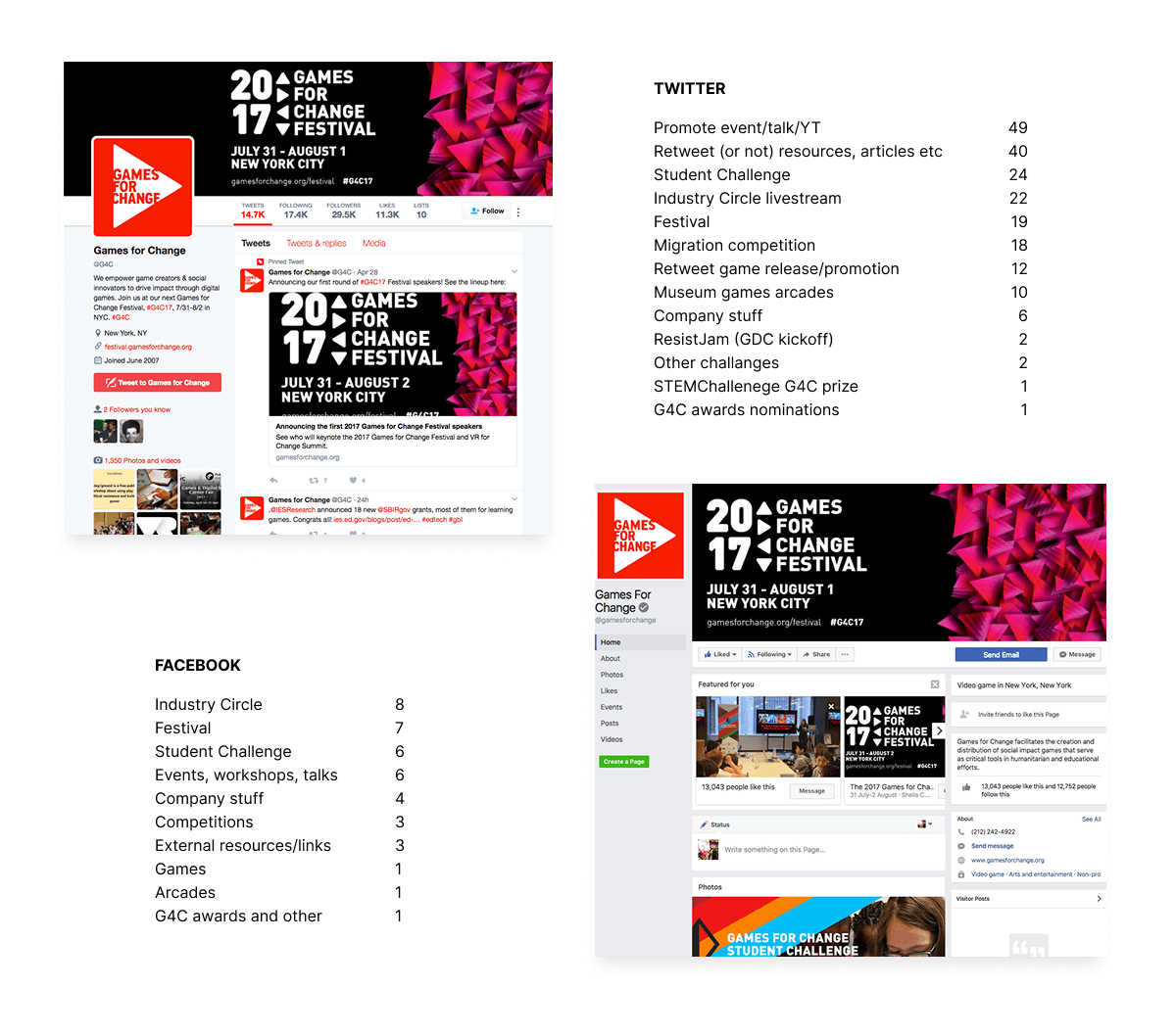
I reviewed and tallied up the different type of posts on their Twitter and Facebook pages, finding these to be the most prevalent:
- Events and talks
- Competitions
- Game releases
- Resources
Although events were posted most frequently, I suspected this was skewed by the nature of social media’s purpose, rather than a representation of their importance. On the website itself, the G4C Festival also felt disproportionately featured compared to their broader mission.
Audience
Defining their target audience was a bit tricky. I looked at their social media followers, event attendees, and game developers, but also questioned some common assumptions.
An IGDA survey described the “typical” game developer as white, cis male, non-disabled, and around 31 years old. Given G4C’s focus on social impact, I believed their audience would be more diverse, including people who might not identify as gamers or developers at all.
I landed on this working audience profile:
- Young adults (18-35 years)
- Interested in social impact and/or games
- Diverse and underrepresented groups
- Creative thinkers, innovative problem-solvers
- Empathetic and socially conscious
- Technologically comfortable
Design trends
I also looked to contemporary website trends for inspiration, identifying design patterns that felt clear, engaging, and modern.
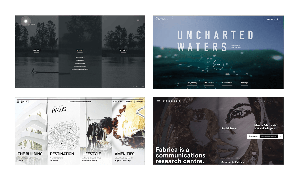
Trends I found included:
- Emphasis on content
- Minimalistic, concise, efficient
- More engagement, micro-interactions
- Geometric, bold, duotone gradients
- Human/conversationalist language
- Responsive layouts
- Personalized content
- Gamification (emerging)
Recommendations & Design
Navigation & User Pathways
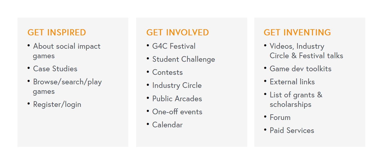
I began by consolidating their existing pages into clearer top-level navigation categories.
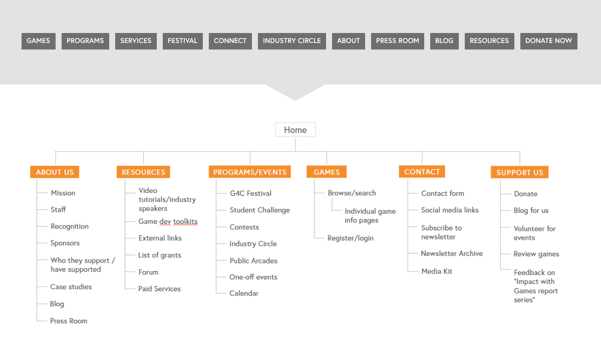
While this improved organization, it still felt bland/traditional and user-agnostic. Users might understand the labels, but not what it really means for them specifically.
To address this, I reframed the navigation around user intent rather than content buckets, trying out a few different tones:
| Traditional | Friendly | Action-oriented | Punchy | Abstract | Final |
|---|---|---|---|---|---|
| About | About us | About us | |||
| Resources | Learn to make games | Get help | Learn | Absorb | Get inventing |
| Programs & Events | Attend and event | Get engaged | Attend | Engage | Get involved |
| Games | Play games | Get inspired | Play | Experience | Get inspired |
| Contact | Contact us | Connect with us | Stay connected | ||
| Donate | Support us | Support us |
The result was three action-oriented pathways that spoke to the user on a more emotional level:
- Get Inspired — For visitors exploring social impact games and learning about G4C
- Get Involved – For users interested in events, especially the festival
- Get Inventing – For game creators seeking tools, resources, and support
Clarifying the Mission
To further guide my design decisions, I rewrote G4C’s mission statement into something more concrete and understandable:
“G4C’s mission is to support and grow the field of social impact games.
Empowering game creators and social innovators (both individuals and organizations) with resources and networks to help them create/distribute social impact games, and educating/promoting the idea of using digital games as an effective means to create real impact for social change.”
This wasn’t meant as final copy, but more for my own reference to help keep their overarching goals in mind.
The website should support this mission, with the goal for the site to be the go-to place for:
- tools/connections for game developers
- newcomers to learn about social impact games
- finding social impact games, giving feedback, supporting developers
I also rewrote the homepage introductory content to better summarize who G4C is and why their work matters. In a real client project, this step would ideally involve close collaboration with a copywriter.
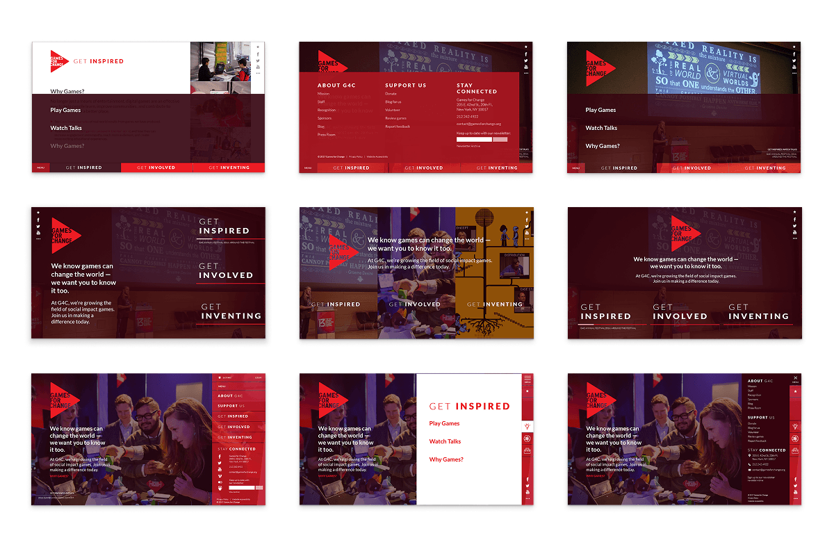
Visual Direction & Layout
With the structure defined, I moved into wireframes and mockups for the homepage. My goals for the visual design were to:
- Create a modern, full-width, responsive layout
- Reflect the innovation and energy of the organization
- Highlight real people and real impact through their existing event photography and videos
- Strengthen visual hierarchy and reduce cognitive load so that users can find what they need faster
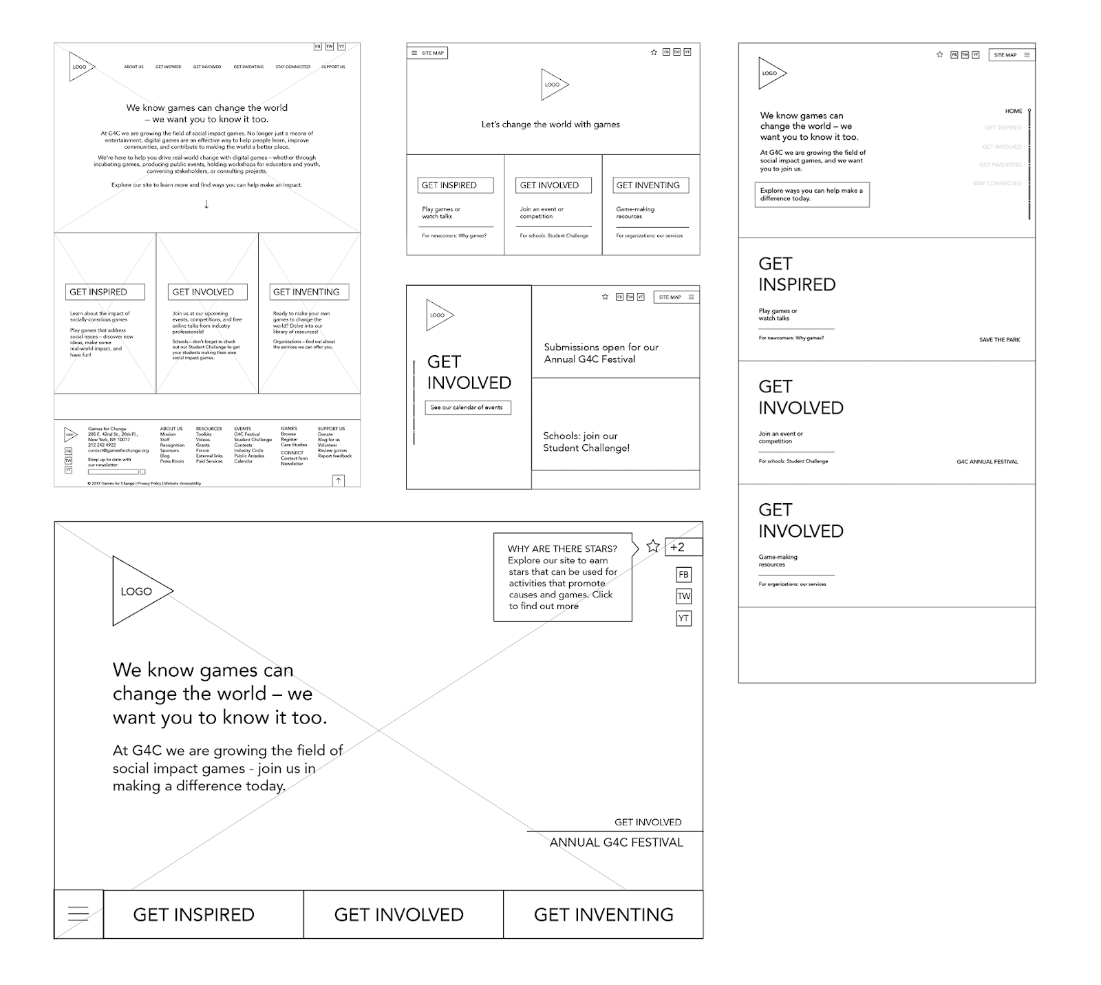
I started with a standard hero section introducing the organization, with the three pathways beneath it, but it quickly felt text-heavy and as cluttered as their existing design.
After a few iterations I simplified it down so that the key information and actions were consolidated and appeared above the fold.
Keeping accessibility in mind (based on the limited knowledge I had at the time), I intentionally kept text labels visible in the navigation rather than relying on icons alone.
Navigation Placement
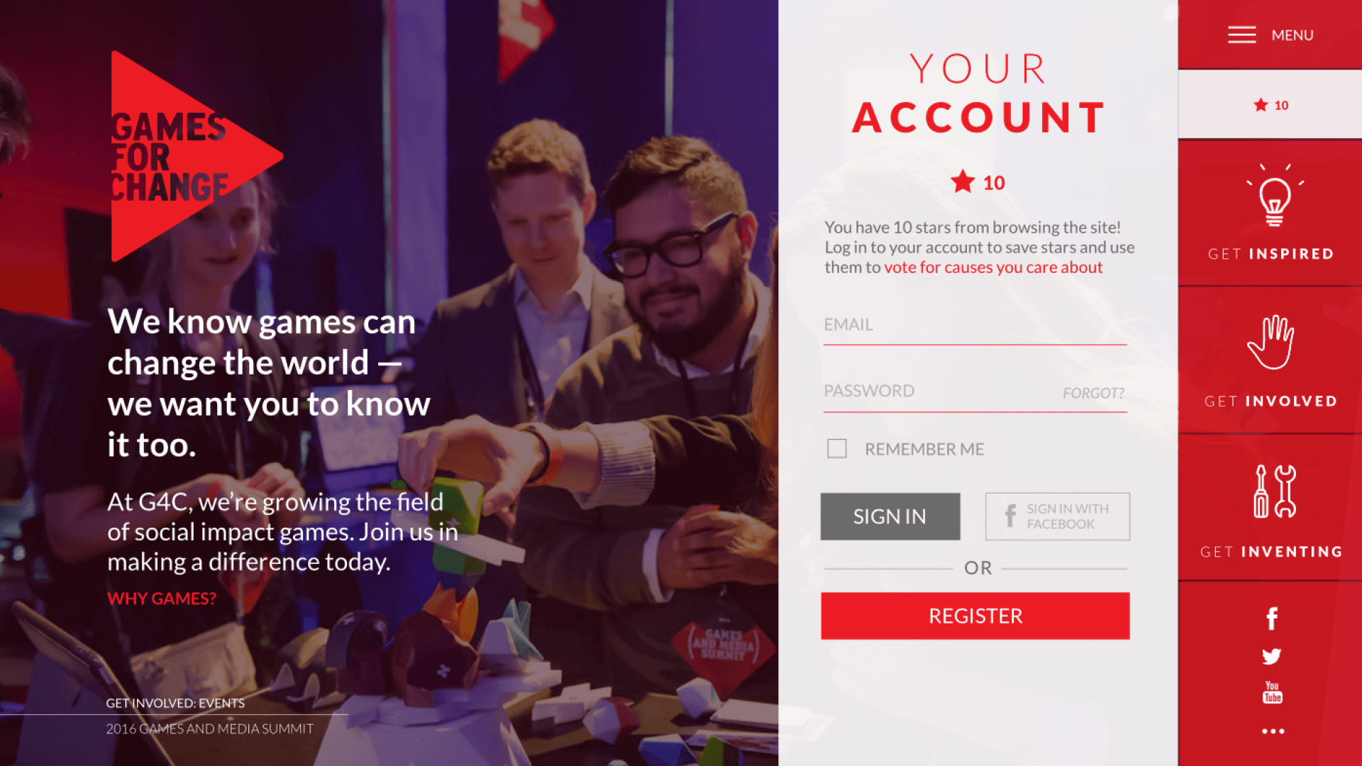
I ultimately moved away from a bottom-aligned navigation, which felt space-heavy and inflexible for future changes. Instead, I decided on a vertical navigation bar on the right side of the screen. This gave the site more of a game/app feel, and allowed the intro content to remain visible while navigating.
This concept was designed for desktop only, but today I’d explore a mobile-first approach, and potentially lean further into an app/game-like experience.
The full-bleed background features rotating photos and videos from G4C events to emphasize the human side of their work.
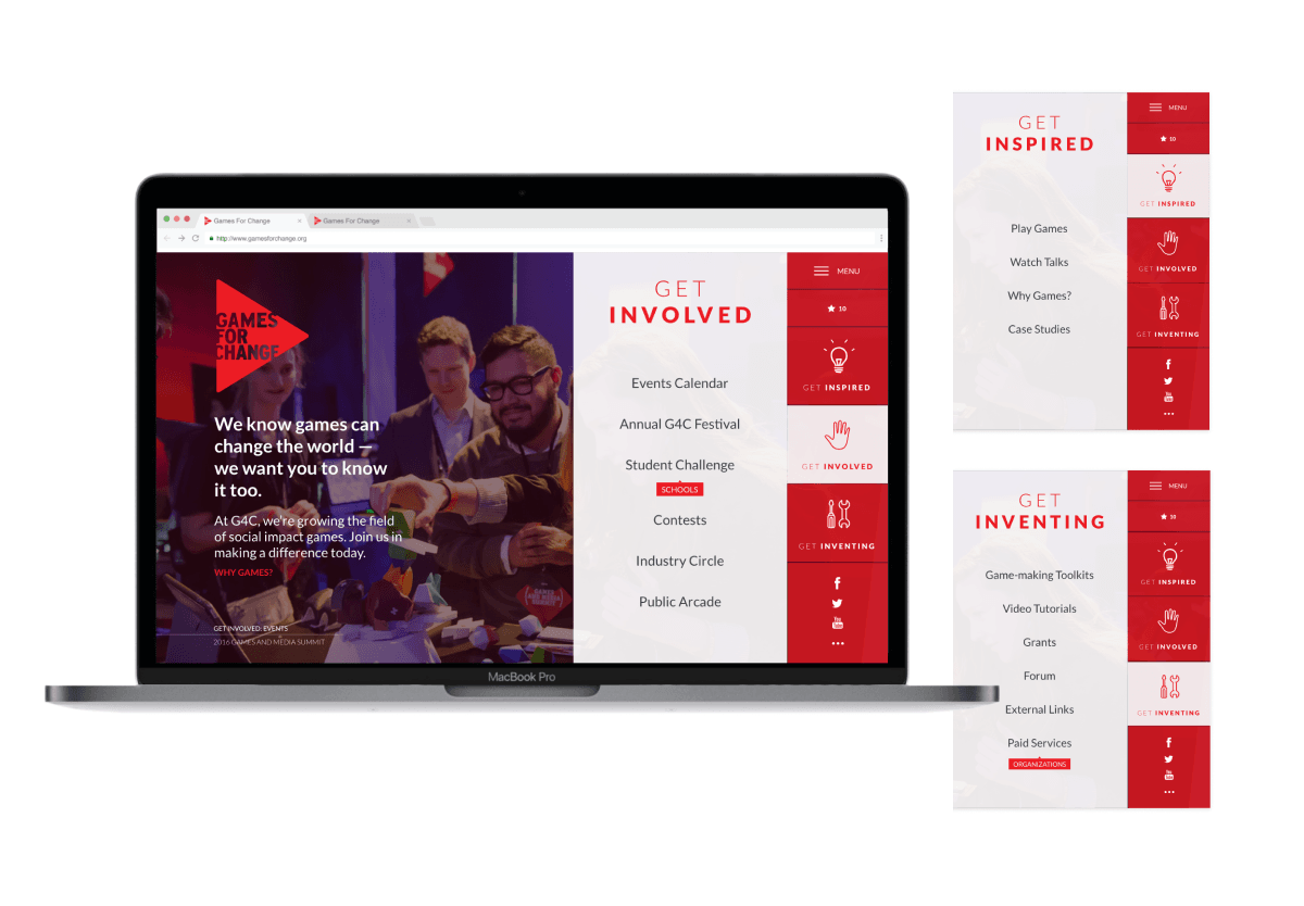
Gamification Concept
To increase engagement, I explored light gamification ideas, such as earning points (stars) for exploring the site, that they could use towards helping causes they care about. Rather than tying points to monetary donations (which is likely not possible for their small organization), I imagined users using them to vote on which games, causes, or organizations G4C would spotlight on social media.
Feature Focus: “Play Games” Page
We had a limited scope for this project, so I focused on one additional page that could benefit most from an update: the “Play Games” page.
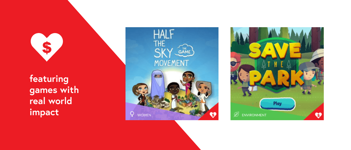
This section lists a collection of social impact games, but the original design didn’t make them feel inspiring, meaningful, or informative.
In early iterations I explored adding user accounts so visitors could save and rate games, along with the stars/points system mentioned earlier. Ultimately, I chose not to include this, as introducing sign-ups too early could create friction, and it felt more important here for users to immediately see the games first.
My final redesign:
- Gave more prominence to game artwork (using a 3 column grid instead of 5)
- Added clear labels for the main social issue each game addressed
- Improved filtering options to support easier search and discovery
To further motivate and inspire users, I also introduced a visual indicator to highlight games with measurable real-world impact, helping users connect play with tangible outcomes.
Reflection
Although this work was never implemented in the real world, it shows the beginnings of my UX leanings and the excitement I had during this process. Today, I’d approach this project with stronger accessibility practices, deeper user research, and more refined visual design, but the core instincts behind it remain the same. I believe my research insights still apply, and could help improve G4C’s since-updated website.