Library Extension:
Finding and borrowing library books faster
Case studyMy Role:
- Product Designer
Deliverables:
- UX audit of existing extension
- High-fidelity UI mockups
- Interactive prototypes
- Component system updates
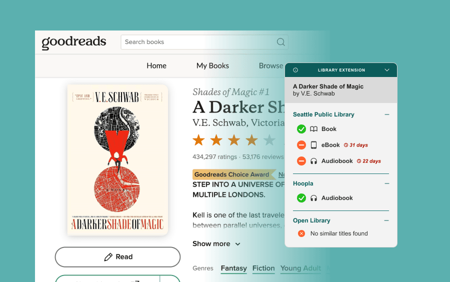
Library Extension is a Chrome extension that appears while browsing Goodreads, showing whether a book is available at your selected libraries. It’s an incredibly useful tool that makes it easy to borrow books or place holds without additional searches.
However, the interface had several friction points:
- The interface felt visually cluttered and overly dense
- Weak hierarchy and extra information made availability harder to scan quickly
- The “Borrow” and “Place Hold” buttons were misleading (implied direct action but simply redirected users to the same page as the title link)
- The overall visual weight felt intrusive within the browsing experience
I redesigned the experience to prioritize clarity and speed, by:
- Strengthening the visual hierarchy to improve scannability
- Removing non-essential and redundant information
- Emphasizing availability at a glance
- Consolidating interactions to eliminate misleading affordances
- Reducing the visual footprint so the extension feels like a lightweight companion rather than an interruption
Design Process
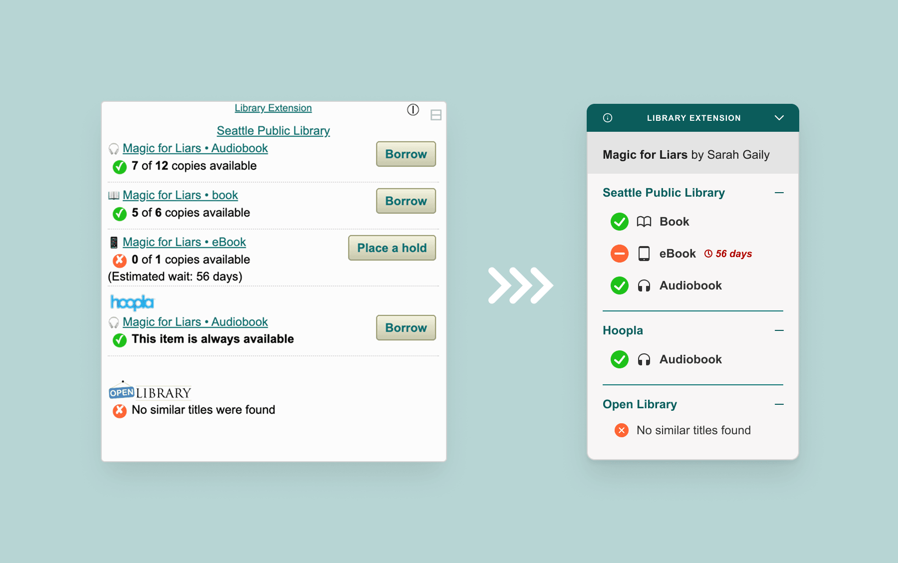
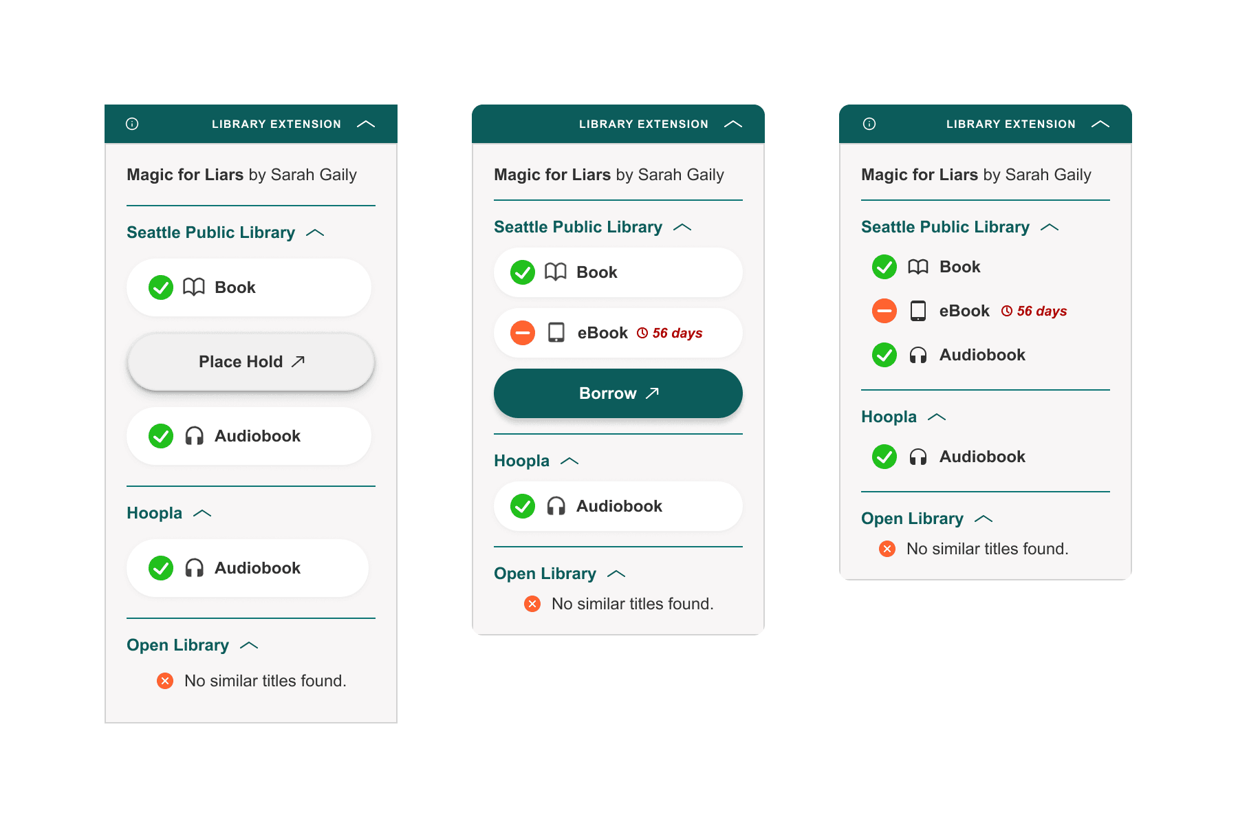
In the initial iterations, I removed repeated book titles and availability counts, as they didn’t meaningfully influence the decision to borrow or place a hold. I also explored restructuring each format (e.g., ebook, audiobook, physical) into its own clickable card, rather than relying solely on separate buttons or title links.
After some refining and creating an initial prototype, I realized that despite reducing information, the extension still occupied a significant portion of the screen. Though it could be collapsed down, I knew it needed to be small enough when kept open for easy viewing without being obtrusive.
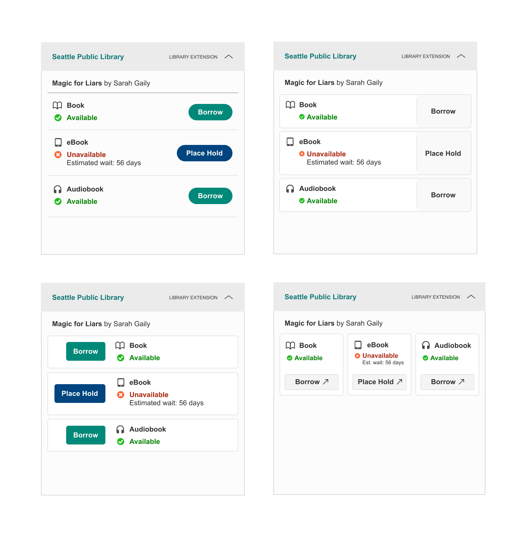
This led me to question the role of the “Borrow” and “Place Hold” buttons. Unlike traditional call-to-action buttons designed to drive conversion, these weren’t needed to persuade users as they are already motivated when checking availability. The extra buttons added visual weight without adding value, so I removed them and made each card the primary interactive element. This simplified the interface, reduced visual noise, and clarified the interaction model.
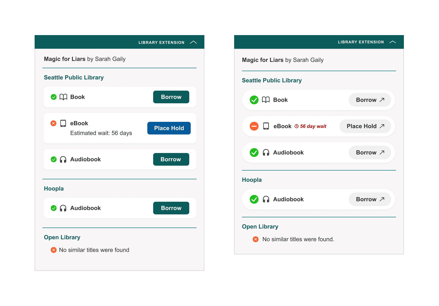
Final Prototype
To further minimize visual impact, I made cards visually defined only on hover, similar to modern contextual menus. This reduced baseline visual density while preserving affordance when needed.
Takeaways & Next Steps
This project challenged my initial assumptions — I began with a vision of how I wanted the extension to look, but the process required deeper consideration around interaction patterns, hierarchy, and visual weight within an existing browsing environment.
Because this redesign is currently based on my own experience and preferences, the next step is validation. I’m exploring ways to gather feedback from other users to better understand what information they prioritize and how they use the extension, so I can potentially bring this to the original developers.
I’m also in the process of learning how to adapt the existing extension’s code so I can at least make use of my redesign locally!