Seattle Animal Shelter:
Helping animal lovers complete their donations
Case study WIPMy Role:
- UX Designer
Deliverables:
- Donation flow audit
- Competitor and UX best-practice analysis
- User flow restructuring
- Wireframes
- High-fidelity UI mockups
- Interactive prototype
The Problem
Seattle Animal Shelter (SAS) is a government-funded shelter, which often means they are overlooked by donors who assume they already receive sufficient funding. As a previous volunteer at a government-funded shelter in San Francisco, I’ve seen firsthand how dependent these organizations still are on public support.
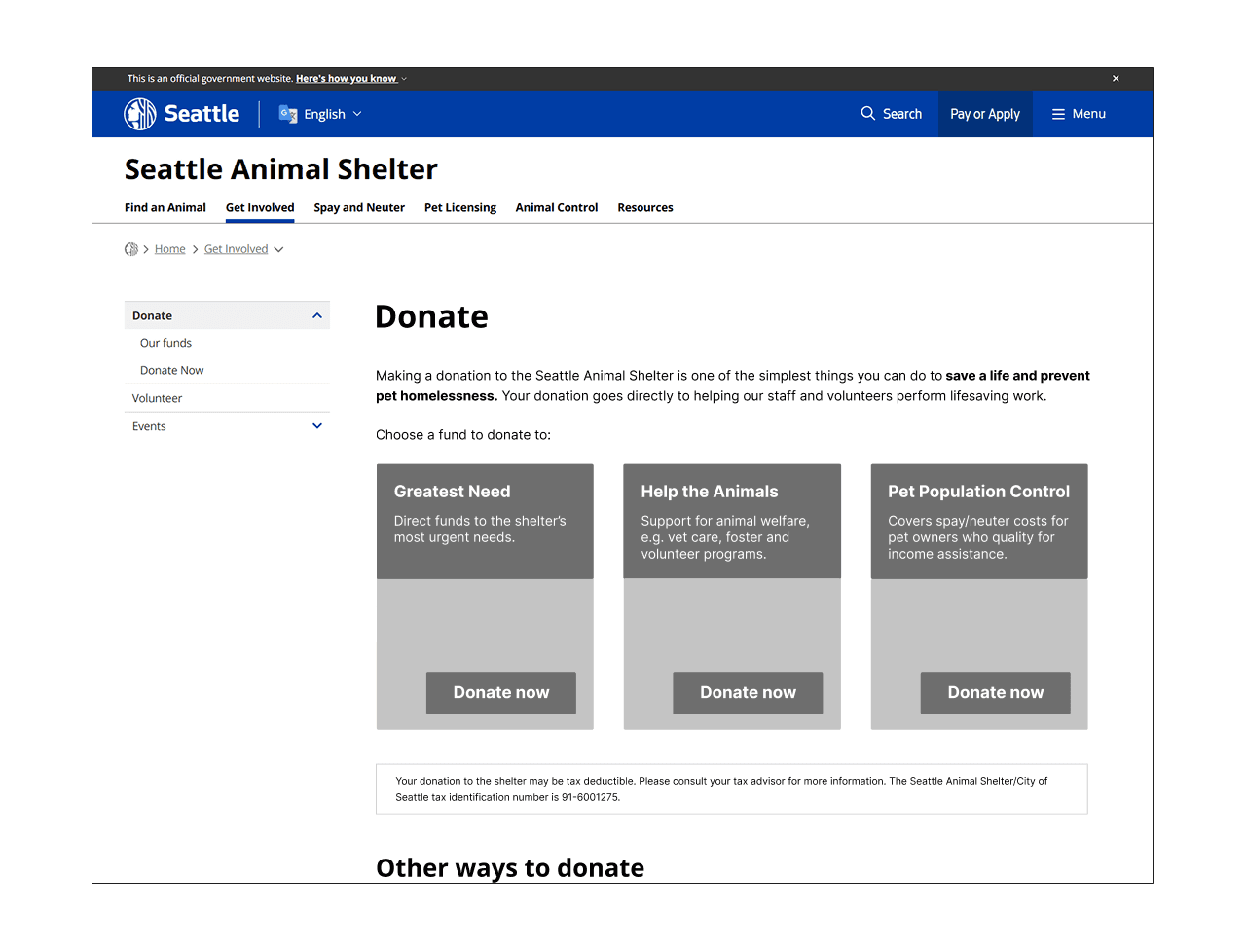
When reviewing the SAS website, I noticed several friction points in their donation experience: low CTA visibility, an abrupt external payment transition with key donation options hidden behind the redirect, and a long multi-step form that increases cognitive load.
These issues likely reduce donation completion rates, especially for first-time donors coming from external channels, who have little patience for friction or uncertainty about trust.
The pathway to donating from the home page is also indirect and low emphasis, but I decided to focus specifically on improving the donation flow after users reach the donation page.
My Design Goals
Increase successful donation completion by:
- Reducing drop-off during donation start and checkout transition
- Improving perceived trust in external payment step
- Reducing cognitive load during donation entry and form completion
The Constraints
- Government website structure and design limitations
- External payment system (.aspx)
- Likely limited engineering resources
These constraints led me to focus on flow and structure rather than visual redesign.
Researching Competitors and Best Practices
I wanted to understand whether the friction points I'd identified were specific to SAS or reflected broader patterns in donation UX, and what the most effective flows had in common.
I researched donation and general shopping/payment best practices, and reviewed donation flows across several similar organizations: a government shelter, well known shelters and animal organizations, and other shelters/rescues in the local Washington area.
Key Insights
Reducing friction
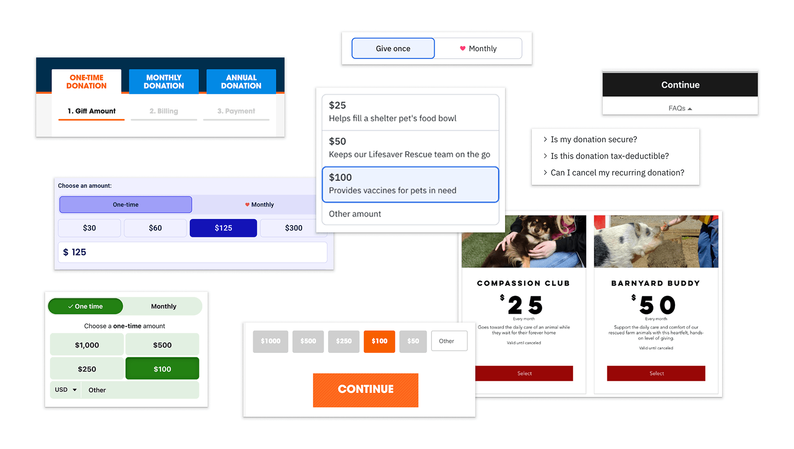
- Multi-step flows are commonly used in donation experiences and reduce cognitive load, making them more effective than single long forms. They also support progressive data capture, allowing organizations to re-engage users who abandon the flow.
- Strong visual hierarchy and minimal initial steps help users begin interacting quickly.
- Compelling imagery and messaging can increase motivation to complete a donation.
Trust & clarity
- Consistent branding reinforces trust throughout the process, especially when redirected to an external page
- Progress indicators help set expectations for the length of the process.
- Common concerns such as tax information, security, and donation usage are surfaced contextually to reduce uncertainty during checkout.
Decision support
- Default amounts and monthly giving options reduce hesitation.
- Tangible, impact-based messaging (e.g. “$25 fills a food bowl”) supports decision-making.
- Visual cues (e.g. heart icons and subtle animations) can guide users toward preferred actions.
Some best practices (impact-based messaging, monthly giving options, and visual delight moments) I didn’t include, due to likely engineering and content constraints within the existing system.
Defining success
These are the metrics I would use to measure success:
- Donation completion rate
- Form drop-off rate
- Time to complete donation
While baseline metrics are unavailable, these KPIs reflect the primary friction points identified in the current experience.
User flow
I mapped the current and proposed donation flows to identify key drop-off points and opportunities to reduce friction. This analysis directly informed the restructuring of the donation flow and prioritization of key interactions.
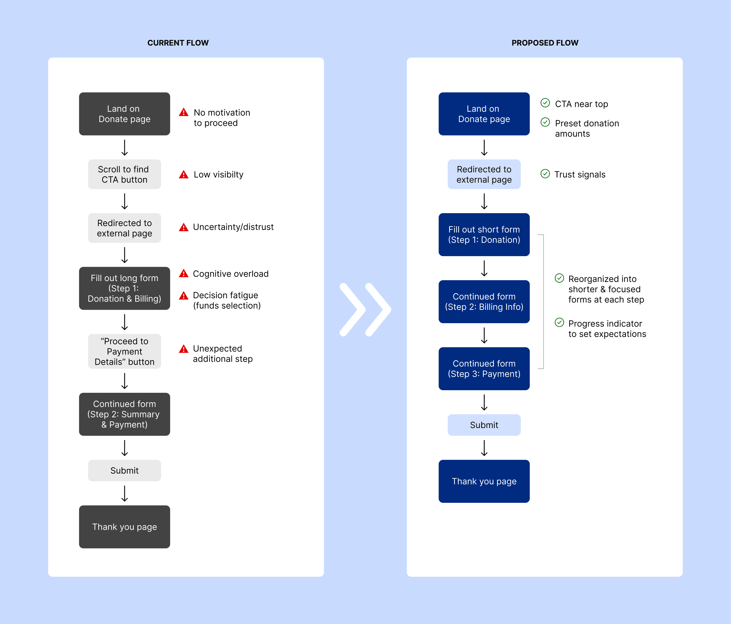
Key friction points in current flow:
- Low visibility of donation entry point
- Unclear external transition
- High cognitive load in long form structure
- Decision fatigue in multiple funds selection
- Unexpected multi-step process increases abandonment risk
How the proposed flow addresses this:
- Immediate access to donation options
- Donation amounts are visible above the fold, reducing time to action
- Informed transition to secure payment
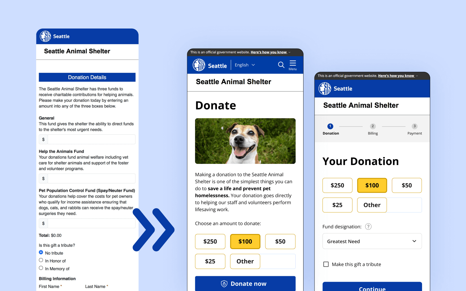
- Simplified, restructured three-step form with clear progress indicator
Design Decisions
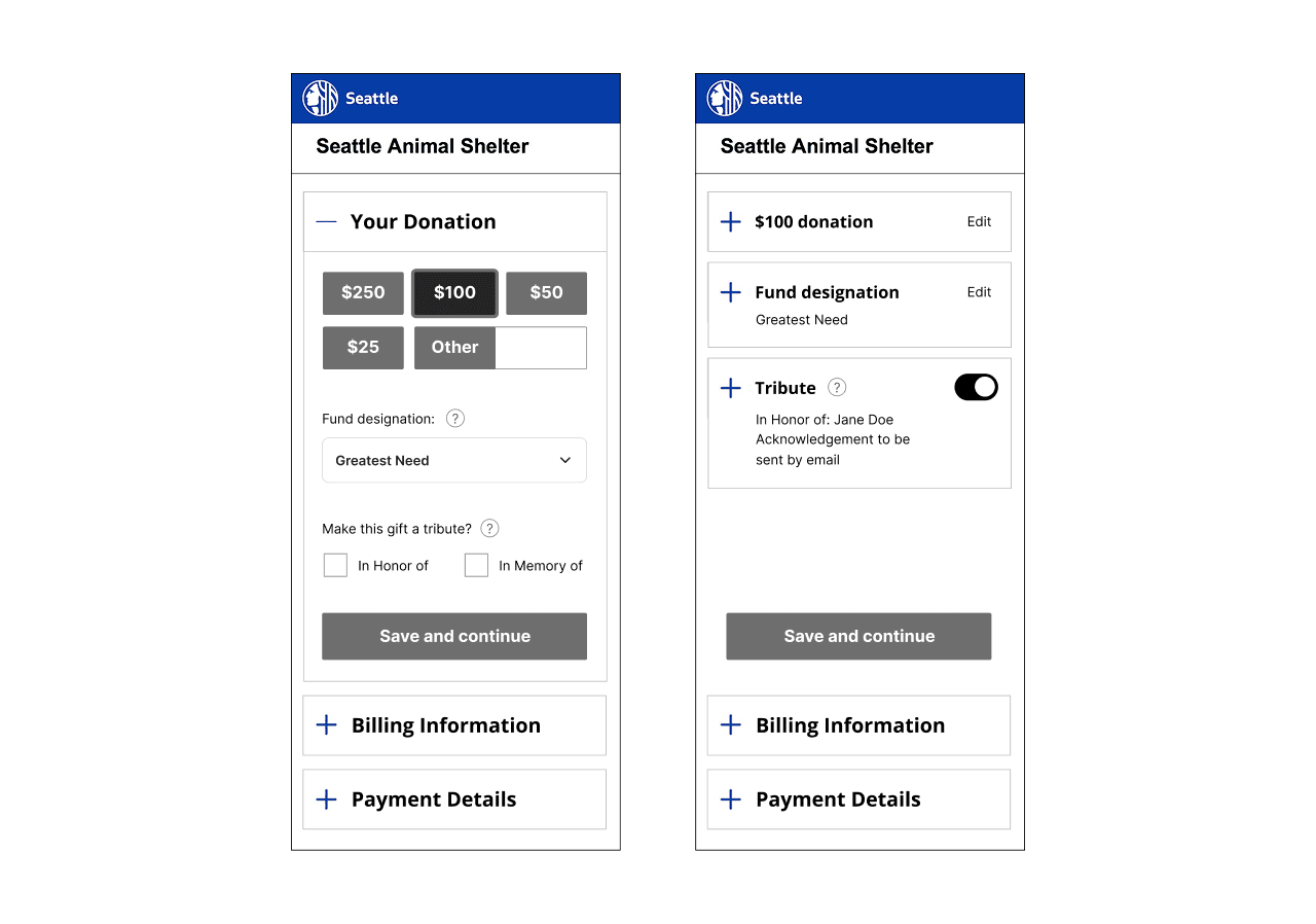
During wireframing, I focused on key interaction decisions that would reduce friction and improve clarity in the donation process. I looked at a few alternative interaction patterns before ultimately prioritizing familiarity and reduced friction.
Structuring the initial donation decision
I explored whether users should select a donation fund before choosing an amount, which would allow for more emotionally compelling storytelling through imagery. But since many donors arrive with a set amount in mind, requiring a more involved choice upfront would increase friction, so I prioritized donation amount as the first step to keep the initial interaction fast and low-effort.
Choosing a familiar multi-step flow
I considered a single-page accordion-style form to reduce page loads and streamline the experience. However, since this pattern is uncommon in donation flows, I chose a conventional multi-step structure with clear progress indicators to maintain familiarity and trust, and reduce cognitive load.
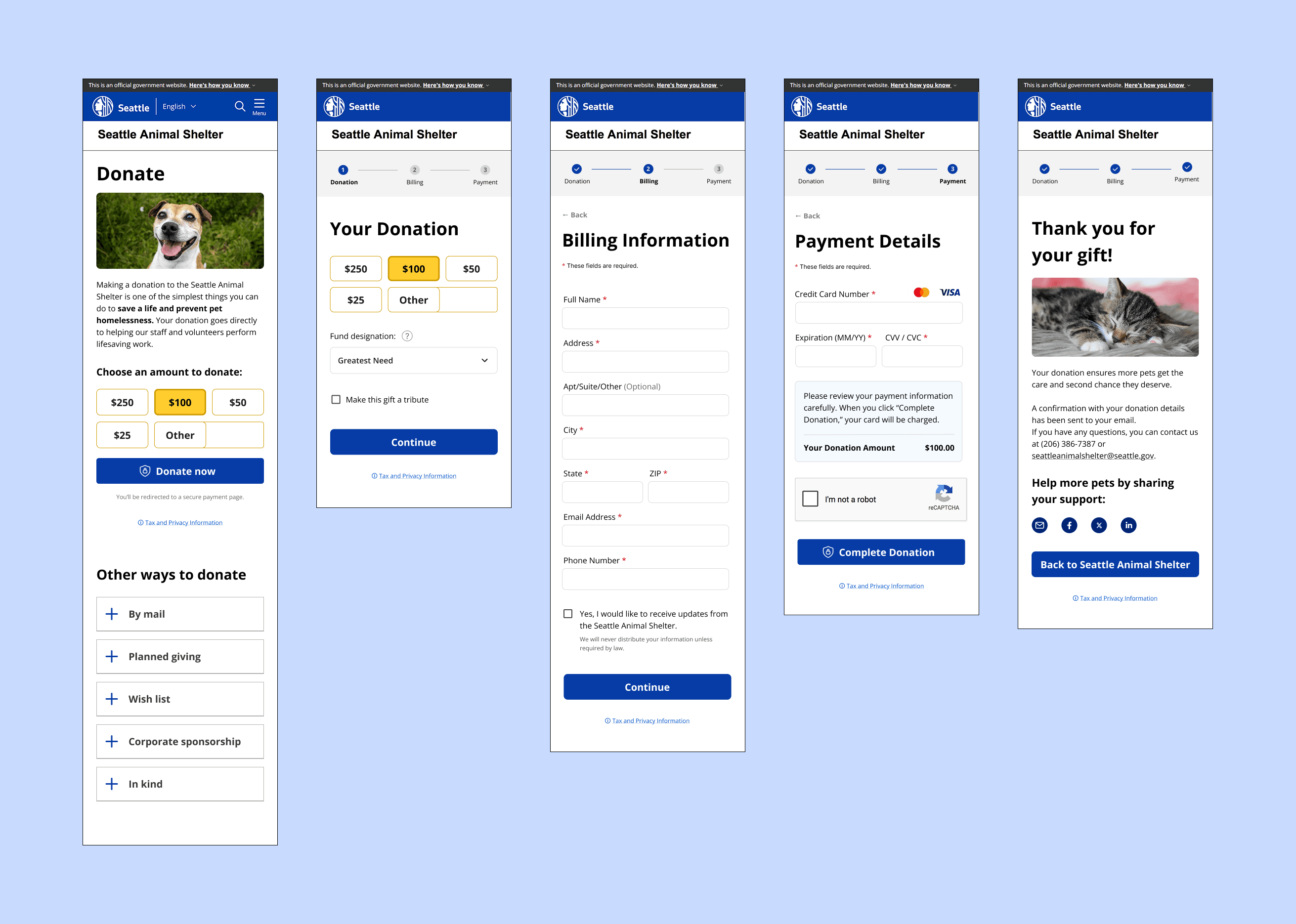
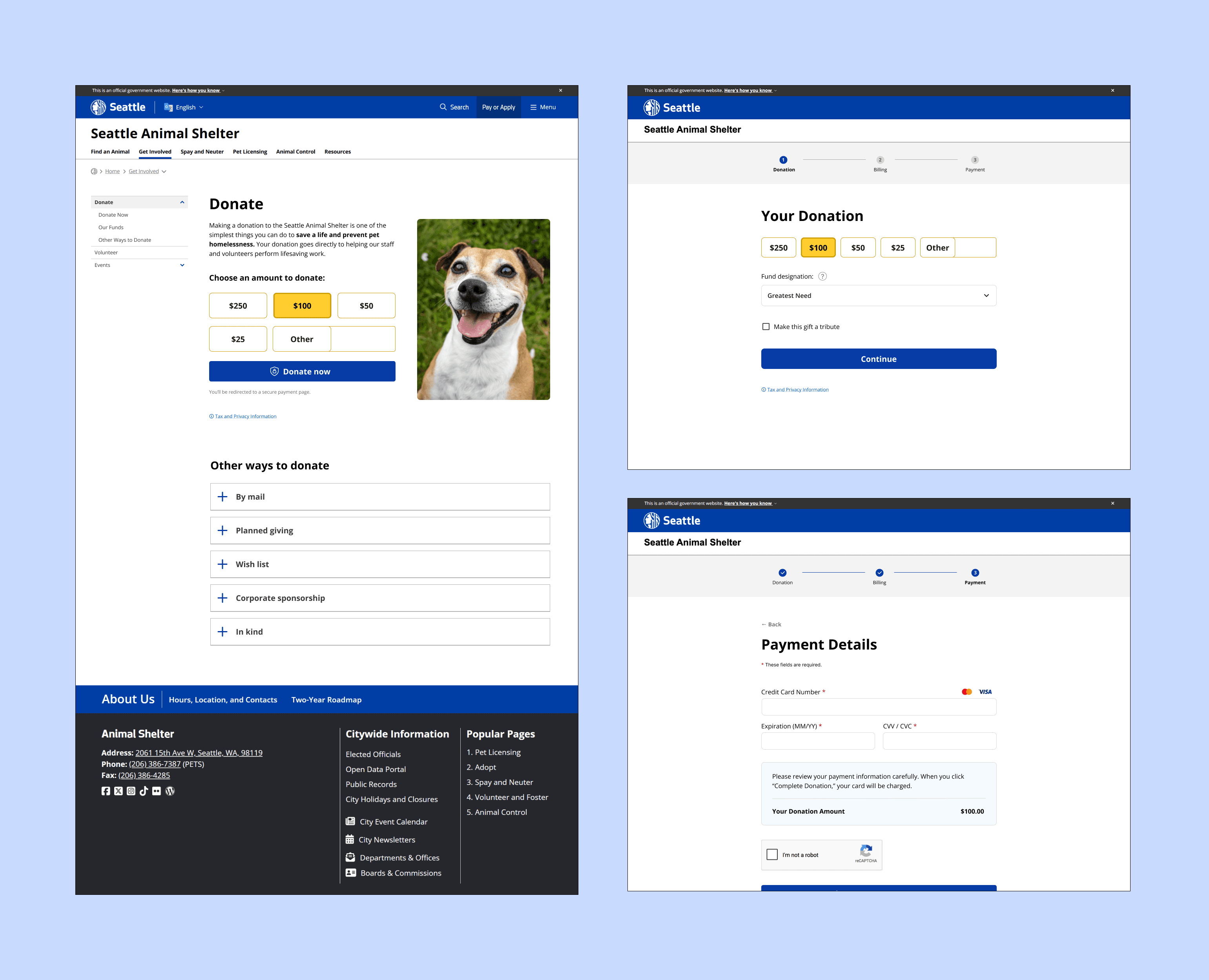
Final Flow & Design
Key UI Decisions
Reduced initial friction
Donation amount selection is presented directly on the landing page, with preset options, and visible above the fold, reducing time to first interaction.
A compelling image is added to further motivate users and remind them what of the cause they are supporting.
Reduced cognitive load
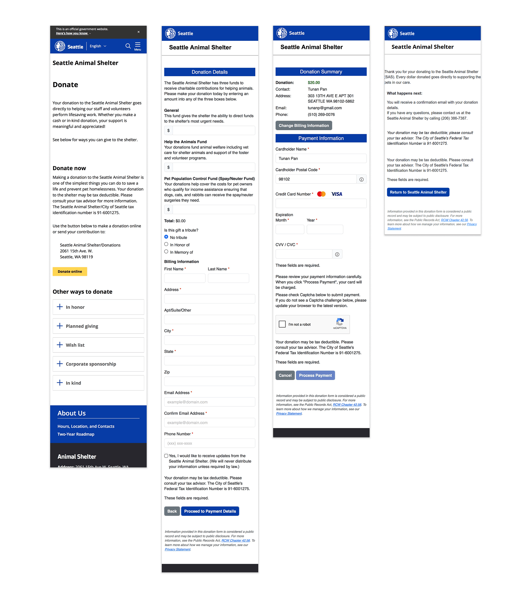
Original copy has been condensed, while secondary information such as tax/privacy details and FAQs is moved behind expandable links.
Mailing information is also relocated to the “Other Ways to Donate” section to reduce visual noise during checkout.
Improved trust during transition
Users are informed before redirecting to the external payment system, and the official government website header remains visible throughout the flow to reinforce legitimacy.
Simplified decision-making
Donations are limited to a single fund per transaction, with clearer fund naming and optional tooltip descriptions for additional context.
Clear progress and structure
A three-step flow separates donation, billing, and payment into focused tasks, with clear progress indicators. On mobile, the continue button is anchored to the bottom for thumb-friendly access.
Prototype (Figma)
Validation & Learnings
After creating an additional interactive prototype to allow for more realistic form input and testing, I conducted informal usability testing with two participants, asking each person to make a donation using both the existing SAS donation flow and my redesigned version.
While the sample size was too small to draw firm conclusions, both participants reached the donation form more quickly using the redesigned flow, suggesting that reducing upfront decisions and surfacing donation amounts earlier helped streamline the experience.
More valuable than the timing, however, was the qualitative feedback. One participant pointed out that replacing the visible fund selection buttons with a dropdown introduced an unnecessary interaction. Although the redesign simplified the decision by limiting donations to a single fund, keeping the available funds visible would make the choices easier to scan and compare without requiring an extra click. They also suggested that fund descriptions would be more discoverable as hover tooltips rather than requiring users to click a help icon.
If I were continuing this project, I would iterate on these interactions before conducting a larger round of usability testing to validate whether they further improve efficiency and confidence during the donation process.
Additional Future Opportunities
Due to likely technical and resource constraints, these opportunities were considered out of scope for this redesign, but could further improve the donation experience in the future:
- Support for additional payment options (e.g. PayPal or Apple/Google Pay on mobile)
- Monthly recurring donations
- Less intrusive fraud prevention alternatives to CAPTCHA